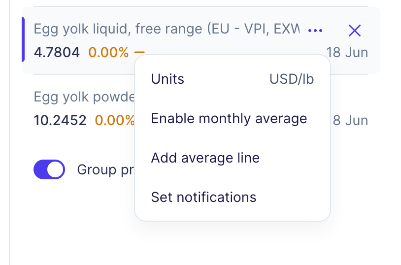

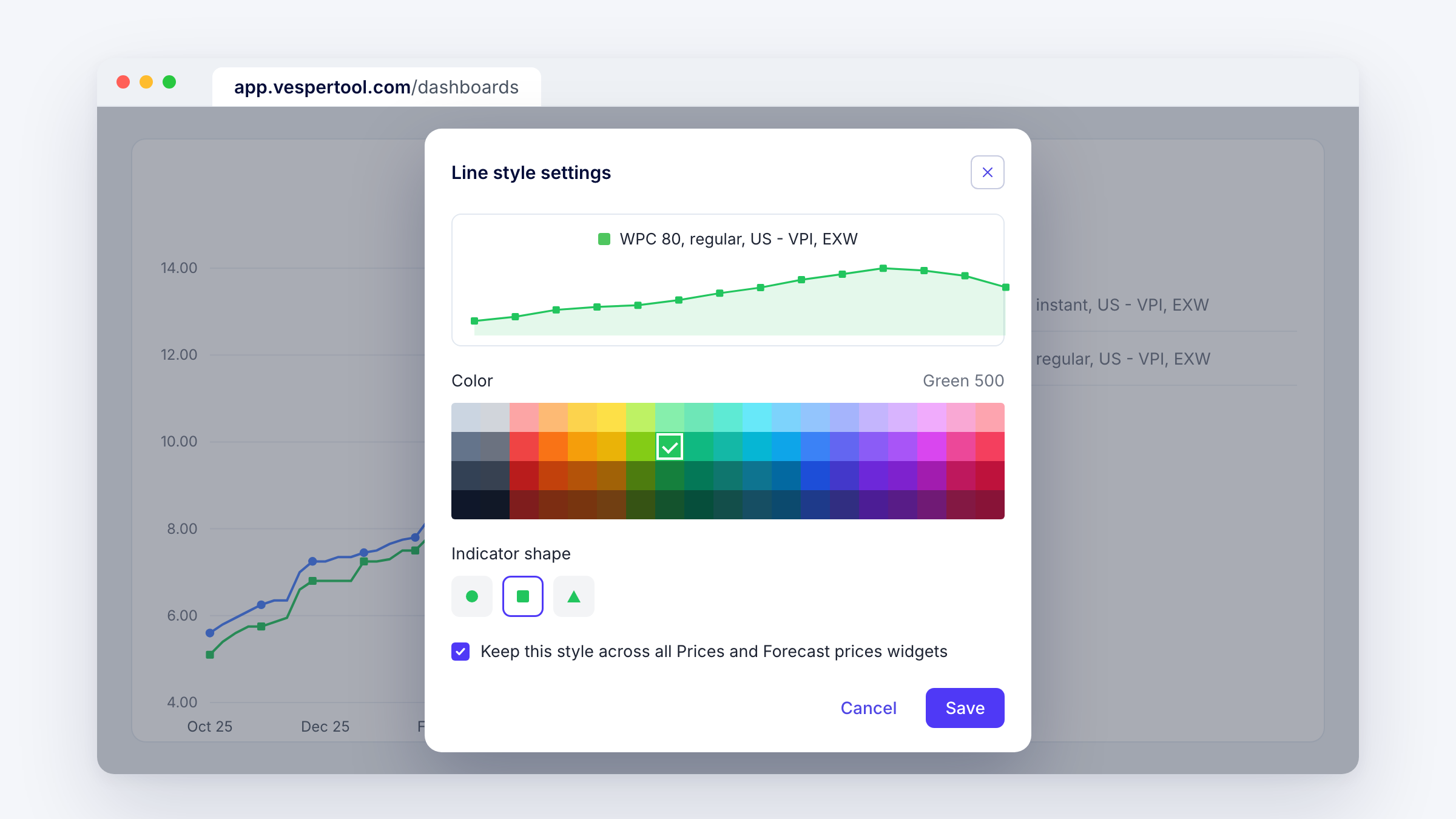
You can now decide how each product looks on your chart. In the Prices and Forecast prices widgets, open More next to a product and choose Line style to set its colour and indicator shape.
What’s new
- Pick a colour for each product from a full palette.
- Choose an indicator shape for each line: circle, square or triangle.
- A preview shows the line before you save it.
- Tick “Keep this style across all Prices and Forecast prices widgets” and the product looks the same everywhere on your dashboard.
Why this matters
A chart you share with your manager or finance team should be readable at a glance. Matching colours to your own reporting, and keeping them the same across widgets, means nobody has to check the legend to know which line is your butter price. Indicator shapes help you tell lines apart when several products sit close together.
How to access
Live for all Vesper users. In the Prices or Forecast prices widget, click More next to a product, then Line style. Questions? Email support@vespertool.com.