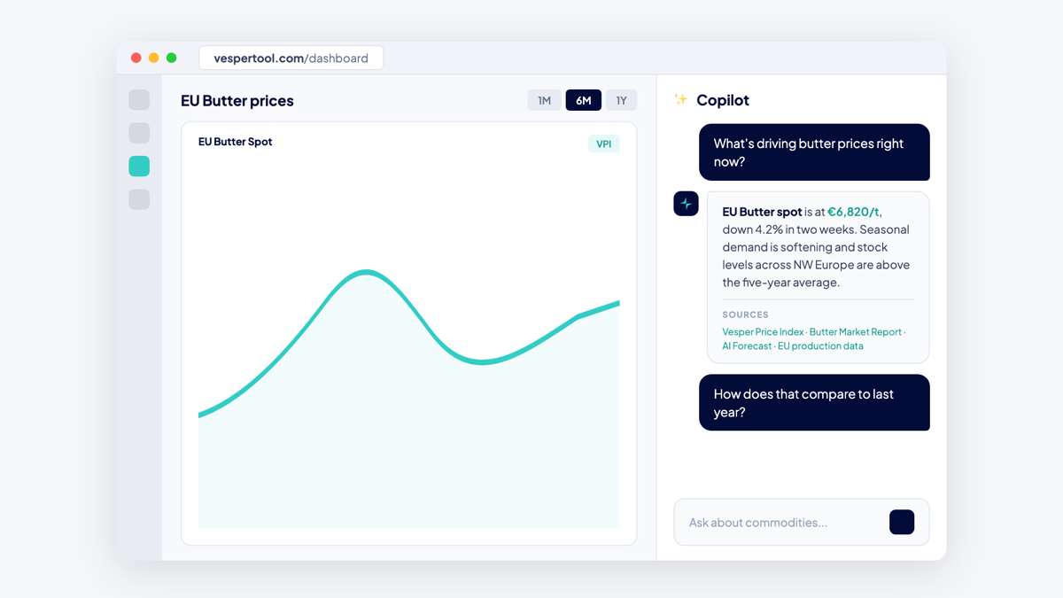


Commodity Copilot now shows a chart next to its written answer. You read the explanation and see the data behind it in the same response.
What’s new:
- A chart appears alongside Copilot’s text answer.
- Copilot picks the recent, relevant data points for your question.
- The charts make an answer easier to read at a glance.
Why this matters: When you ask Copilot why a price moved, text alone leaves you to picture the move yourself. Seeing the curve next to the commentary lets you sanity-check the reasoning before you act on it. For the deeper, analyst-style questions, that extra context helps you trust the answer.
Good to know: These charts are not interactive widgets. For full interactivity, custom views, trend lines, or unit changes, keep using your dashboards.
How to access: Charts support the deeper, analyst-style answers on the Pro plan. On Core and Premium you can see them when you use one of your three quarterly Pro question tokens. Contact your Customer Success Manager for help or to activate the full Copilot on your account.