Procurement teams want forecasts they can defend in front of a CFO. That’s a higher bar than a chart with a line on it. It means knowing what’s behind the line: which inputs the model uses, where they come from, and why the curve moved this morning when it didn’t move yesterday.
This article walks through how Vesper builds its AI price forecasts, the architecture, the four input layers, and the data sources that flow into a single specific forecast: US WPC80, instant grade, the headline whey protein concentrate used across sports nutrition, RTD, and fortified foods.
If the methodology behind AI commodity forecasts has always felt like a black box, this is the article that opens it up.
Reading a Vesper forecast: what you’re looking at
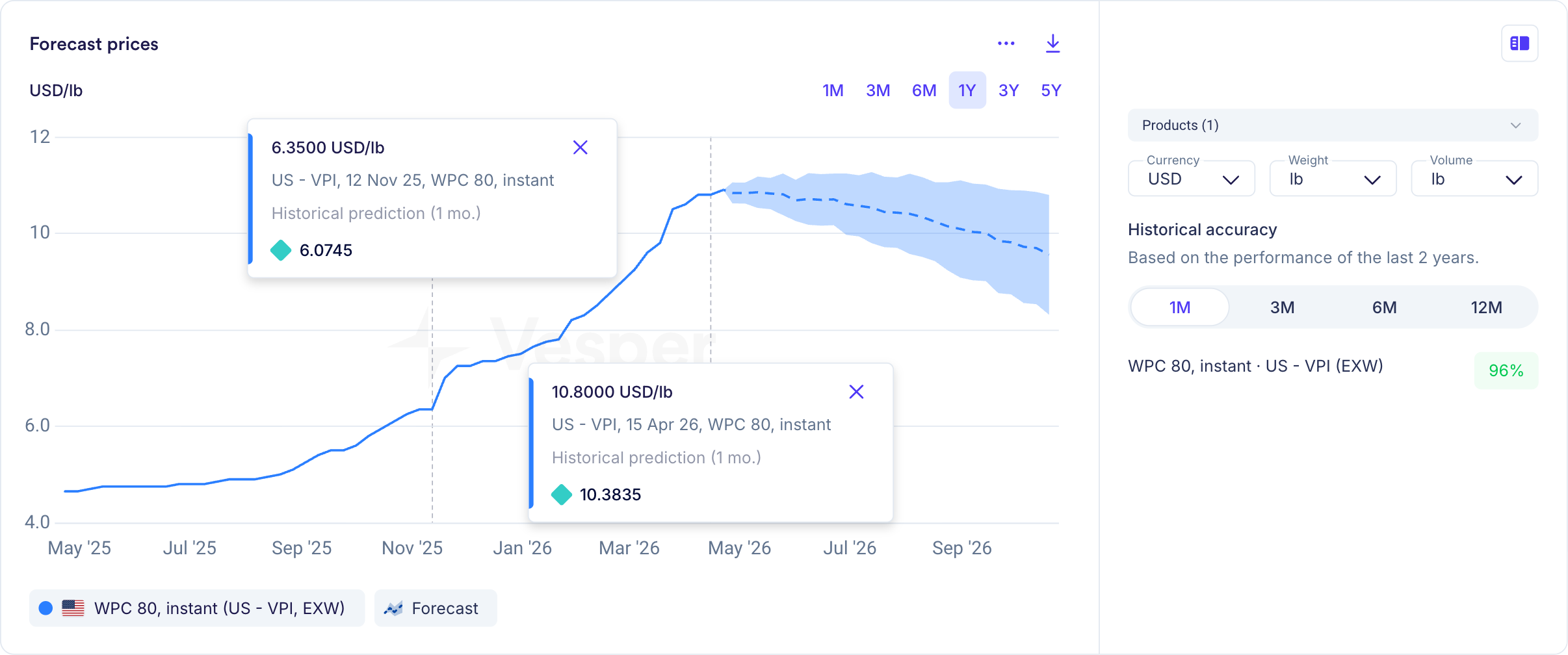
The chart above is the forecast widget recorded on 29 april 2026, for US WPC80 instant, priced in USD per pound, anchored on Vesper’s proprietary VPI benchmark on an EXW basis. There are four elements to read.
The solid blue line is the historical price series, what US WPC80 instant has actually traded at over the past twelve months. The dashed line that picks up where the historical series ends is the AI forecast curve, projecting the price six months forward. The shaded band around the dashed line is the confidence interval, the range the model considers plausible at each point along the forecast. The narrower the band, the more confident the model.
Hover any point on the historical line and a tooltip surfaces two numbers side by side: the actual price on that date, and what the model had forecasted for it one month earlier. On 12 November 2025, for example, the model’s one-month-ahead forecast was $6.07/lb against an actual of $6.35/lb, a deviation of 4.4%. On 15 April 2026, the forecast was $10.38/lb against an actual of $10.80/lb, a deviation of 3.9%. Both got the direction right, and both landed within the model’s average error band. This is the chart’s in-product accuracy check: any buyer can spot-check the model against reality without leaving the screen.
The 96% historical accuracy figure on the right summarizes that pattern across the last two years of one-month-ahead forecasts on this series. The metric is MAPE (Mean Absolute Percentage Error) meaning the model came within about four percent of the realized price on average. The toggle lets you check the same accuracy figure for three-, six-, and twelve-month horizons; accuracy declines as the horizon stretches out, which is what you’d expect from any honest forecasting model.
Across all 4,000+ commodity series Vesper covers, the platform-wide averages are 97% at one month, 94% at three months, 91% at six months, 88% at nine months, and 85% at twelve months — the graceful degradation an honest model should produce. For US WPC80 instant specifically, the figures read 96% at one month, 88% at three months, and 79% at six months. The gap between WPC80 and the platform average widens as the horizon stretches, which is itself informative: WPC80 is more volatile than the average commodity Vesper covers, so the model gets tested harder at longer horizons here than it would on, say, a more stable cheese or butter benchmark.
Now to the part most prospects want answered: how does the dashed line get drawn?
The architecture: foundation models for time series
Vesper’s forecasts are built on foundation models for time series, an architecture that mirrors how large language models work for text, applied instead to numerical data over time.
Foundation models are pre-trained on enormous datasets across many domains before they ever see your specific commodity. For LLMs, that’s billions of pages of text. For time series, it’s billions of data points spanning financial markets, energy prices, weather patterns, agricultural yields, and a long list of other temporal datasets. By the time the model is fine-tuned on US WPC80 specifically, it has already learned what supply shocks, seasonality, demand cycles, and regime shifts tend to look like in price data, even if it had never previously seen a single observation of WPC80.
This is a meaningful architectural choice. Older forecasting approaches, ARIMA, exponential smoothing, early machine-learning models, treat each commodity as a closed system. They learn from the history of that one series and extrapolate forward. Foundation models, by contrast, transfer pattern knowledge across series. That’s why a forecast for a relatively niche product like instant WPC80, which trades in lower volumes than, say, butter or Class III milk, can still draw on patterns the model has internalized from thousands of related and unrelated series.
The model is then enhanced with Vesper’s proprietary training data and fine-tuned on the specific dynamics of agricultural commodities. The result is a forecast layer that’s transparent by design: users can see the inputs and assumptions feeding the curve rather than receiving a black-box output.
Where Vesper’s AI forecasting sits in the methodology spectrum
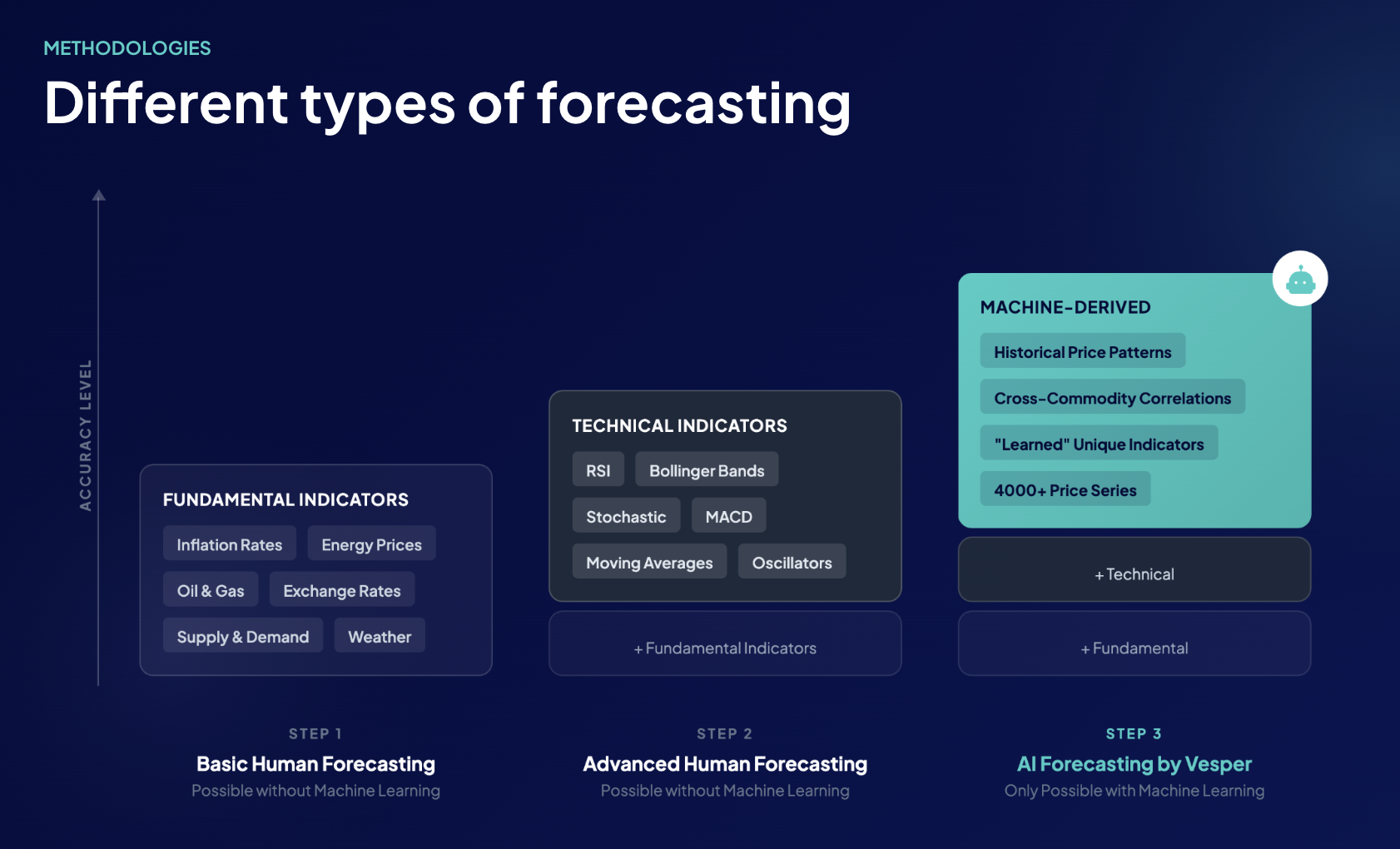
Forecasting commodity prices isn’t a new discipline. The methods procurement teams are familiar with sit on a spectrum that the foundation-model approach builds on rather than replaces.
The most basic level is fundamentals-only forecasting: supply and demand balances, inflation rates, energy prices, exchange rates, weather. This is the analyst-desk standard, and it gets a lot right. A more advanced level layers technical indicators on top, RSI, Bollinger Bands, MACD, moving averages, stochastic oscillators, and similar tools borrowed from financial markets and applied to commodity series. Both of these levels can be done by humans with spreadsheets and discipline.
AI forecasting starts where the human-led approach leaves off. It includes everything fundamentals and technical indicators provide, then adds three things a manual process can’t reach: cross-commodity correlations across thousands of related and unrelated series, machine-derived patterns inside those correlations, and “learned” indicators the model identifies on its own, relationships between variables no rulebook would have flagged. That’s the level Vesper’s forecasts operate at, across more than 4,000 commodity price series.
The point isn’t that older methods are wrong; they’re foundational. AI forecasting compounds them, and the accuracy gain is what you’d expect when each layer adds new information.
The four input layers behind a forecast
Once trained, the model uses four categories of input to produce the forward curve. For US WPC80 instant, those layers look like this.
Price patterns. The starting point is the series itself, the historical record of US WPC80 instant trading on Vesper’s VPI. Around it, the model also reads adjacent and related series: WPC34, WPI, MPC, casein, lactose, US cheese block prices, and CME Class III milk. WPC80 doesn’t trade in isolation. Whey is a co-product of cheese-making, so cheese economics flow directly into whey availability. WPI and WPC34 are substitutes at different protein-content tiers; when buyers shift up or down the protein ladder, those series move together and the model picks up the relationship.
Market fundamentals. This is the supply-and-demand layer, and it’s where most of the explanatory power lives. For US whey proteins, the model ingests data from the USDA NASS Milk Production report (monthly), the USDA Dairy Products report (monthly cheese, butter, NFDM, and whey output), the USDA Cold Storage report (dairy product stocks), and USDA FAS export data (where US whey is going, China, Mexico, and Southeast Asia are the volume drivers). EU production data from the European Milk Market Observatory and dairy figures from DCANZ in New Zealand also feed in, since global supply affects US export pricing. Feed costs from CBOT corn, soybean meal, and DDGS series enter the model because they shape the milk-production margin, which shapes milk supply, which shapes whey supply downstream.
Technical indicators. The model reads classic technical signals applied to the WPC80 series, MACD for momentum, moving averages for trend direction, RSI for overbought and oversold conditions, alongside Bollinger Bands and stochastic oscillators. Each of these is also exposed to users directly inside Vesper’s technical analysis view, but for forecasting purposes they feed the model. They aren’t decisive on their own, but they sharpen short-horizon forecasts when fundamental data is sparse between USDA report drops.
Macro and economic indicators. Broader signals that affect commodity pricing across categories, the US dollar index (which shapes export competitiveness for US whey), energy prices (a material manufacturing input for spray-drying whey), and macro demand indicators tied to functional food categories. Where Vesper has partner data, for example, freight rates from Upply or industry manufacturing-cost data from IBISWorld, that flows in here as well.
The model weighs all four layers together. No single input dictates the curve.
What the technical layer is showing on US WPC80 right now
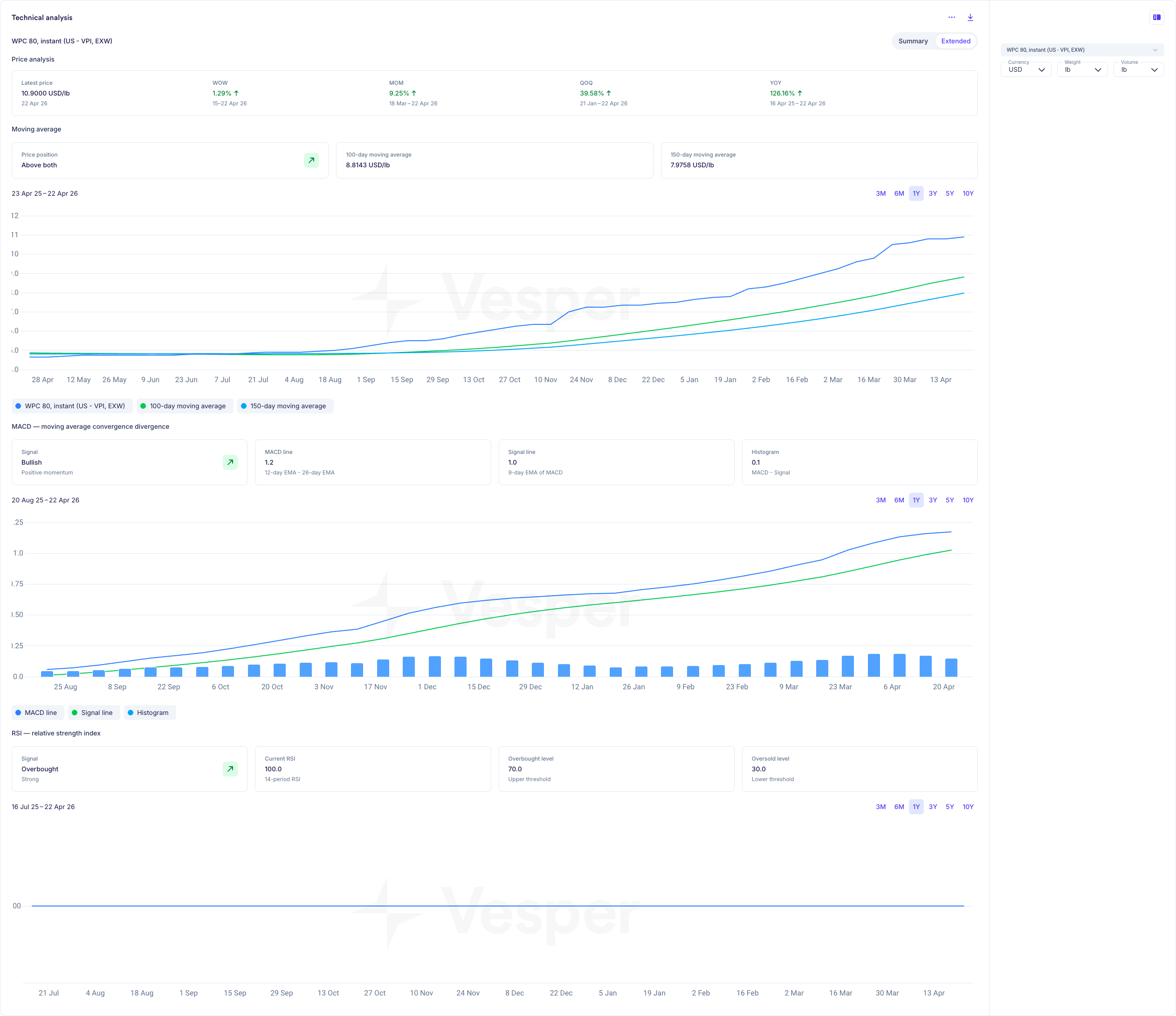
Because Vesper exposes the technical layer directly in the platform, a buyer can read the same signals the model reads. For US WPC80 instant as of late April 2026, the picture looks like this.
The price is trading at $10.90/lb, well above both the 100-day moving average ($8.81/lb) and the 150-day moving average ($7.98/lb). On a year-on-year basis it’s up 126%. The MACD signal is bullish at +1.2 with positive momentum still building. The RSI reads 100, strongly overbought, well past the 70 threshold that typically flags a market running ahead of itself.
Read together, those signals describe a market that has rallied hard, decoupled from its medium-term trend, and is now showing late-cycle exhaustion. Whether the next move is sideways consolidation or a sharper retracement, the technical layer is telling buyers the upside has gotten thin.
That’s the same picture the AI forecast curve draws in the forecast widget: a gentle decline over the next six months as the price unwinds back toward trend. The fundamentals layer and the technical layer are agreeing on direction, which is what builds conviction in the curve. If they disagreed, the forecast would reflect the tension and the confidence band would widen.
This is where technical indicators actually pay off for procurement work. Not as standalone trading signals, but as a reality check on the fundamentals view. Dairy fundamentals can support a higher price; technical indicators tell you whether the market has already priced it in.
Where the data comes from
Vesper’s data architecture is layered intentionally so every input can be traced back to its source. The forecast for US WPC80 sits on top of a stack that runs from public reference data, through licensed and partner data, to proprietary benchmarks.
The public layer covers USDA reports, AHDB, ZuivelNL, Kempten, and the equivalent agencies in regions where Vesper operates, the same primary sources US procurement teams already trust. The futures layer adds CME (dairy, grains, livestock), EEX (European butter and SMP), and NZX (New Zealand dairy). The partner layer brings in licensed data from Oilworld, Fastmarkets, IBISWorld, Barchart, Upply, and Euronext. The proprietary layer is the Vesper Price Index, independent benchmarks for niche products where no public price discovery exists, including the WPC80 instant series anchoring this article.
For a US WPC80 forecast specifically, the VPI is the primary price series, the USDA Dairy Products report is the primary supply signal, CME Class III is the primary milk-economics signal, and CBOT corn and soybean meal anchor the feed-cost layer. The same logic applies across the 4,000+ products Vesper covers, different commodity, different mix of public reports, futures contracts, partner sources, and proprietary indexes, but the same architectural principle.
Why AI and analyst views stay separate
One design decision worth flagging: Vesper deliberately separates the AI forecast from the analyst commentary.
The AI forecast curve is, by construction, free of analyst opinion. It reflects the data and only the data. Vesper’s analyst team produces plain-English market reports, the why behind the move, alongside the forecast, but the analyst view never blends into the curve itself.
The reason is procurement-team trust. When a buyer asks what Vesper thinks will happen to WPC80 over the next six months, there are two answers, and the buyer can see both. The AI says one thing, the analyst says another, and where they agree, conviction is high. Where they diverge, that’s a signal to dig in. Competitors who blend AI and analyst views into a single output remove that signal, and procurement teams have told us repeatedly that the separation is what builds confidence in the forecast.
How to read the chart for buying decisions
Two parts of the chart matter most when a buyer is sizing a forward commitment: the confidence band on the forward curve, and the historical prediction tooltips on the past line.
The confidence band is where buying decisions actually live. A narrow band early in the forecast horizon that widens further out is the normal shape, the model is more certain about next month than about Q3 next year, and it should be. When the band widens unusually fast, that’s the model signaling that the inputs are sending mixed messages and you should expect more revision in upcoming forecasts. When the band stays unusually narrow, the inputs are aligned and conviction is high. A buyer making a forward physical commitment for Q3 isn’t betting that the price will land exactly on the dashed centerline; they’re sizing coverage against the range the band describes.
The historical prediction tooltips are how the band’s credibility gets earned in the first place. Whether or not the 96% headline figure means anything to your team is much easier to judge after spot-checking five or ten past predictions on a series you actually buy. Pick a few months across the last two years, hover the line, and read the predicted-versus-actual pair. If the model has tracked your commodity well, the conviction to act on the forward curve follows naturally.
What this adds up to
A trustworthy commodity forecast has three things working together: a model architecture that can generalize across series, a transparent input stack that traces back to known data sources, and the discipline to keep the AI curve and the human analyst view separate so each can be evaluated on its own merits.