
Procurement teams sizing forward contracts for agricultural commodities like butter, whey protein, sugar, or vegetable oil tend to ask two questions about a forecast they’re considering committing budget against: how was it built, and how accurate is it on the commodity I actually buy?
Most forecasting tools answer the first question vaguely and the second one with a single headline number. Vesper answers both. This article opens with the accuracy figures Vesper publishes across the full commodity price coverage, walks through what makes those figures different from the alternatives most procurement teams have evaluated, and shows how to read a single forecast on the screen, using US Butter as the worked example.
Vesper’s forecast accuracy across 4,000+ price series
Vesper publishes platform-wide accuracy across more than 4,000 commodity price series, measured over the past two years of forecasts. Across every category Vesper covers, from highly liquid markets like CME cheese, MATIF wheat, and Class III milk to thinly traded specialty proteins, EUDR-compliant palm fractions, and regional sugar benchmarks, the headline numbers come out as follows.
| Forecast horizon | Accuracy (1 − MAPE) |
| 1-month forecast | 97% |
| 3-month forecast | 94% |
| 6-month forecast | 91% |
| 9-month forecast | 88% |
| 12-month forecast | 85% |
Performance of Vesper Price Forecasting, measured as 1 − MAPE across 4,000+ price series over the past two years.
The metric behind those figures is Mean Absolute Percentage Error (MAPE), inverted into the accuracy headline. The mechanic is straightforward: if a one-month-ahead forecast is 3% off in January, 4% off in February, and 2% off in March, the average error is 3%, so the model is shown as 97% accurate. The same definition holds across every series and every horizon, which is what makes the number comparable.
Two patterns inside the table are worth flagging.
The accuracy curve degrades cleanly as the horizon stretches. The 12-percentage-point drop from 97% at one month to 85% at twelve months is what an honest forecasting model produces. The further out the model is asked to look, the harder the test gets.
And the figures are averages across thousands of series, not a single hand-picked commodity. A high accuracy claim on one calm market over a few months is easy to manufacture; a published figure averaged across 4,000+ series over two years is a different test entirely.
Three levels of forecasting, and where Vesper sits
Forecasting commodity prices isn’t a new discipline. The methods procurement teams are familiar with sit on a spectrum that AI forecasting builds on rather than replaces.
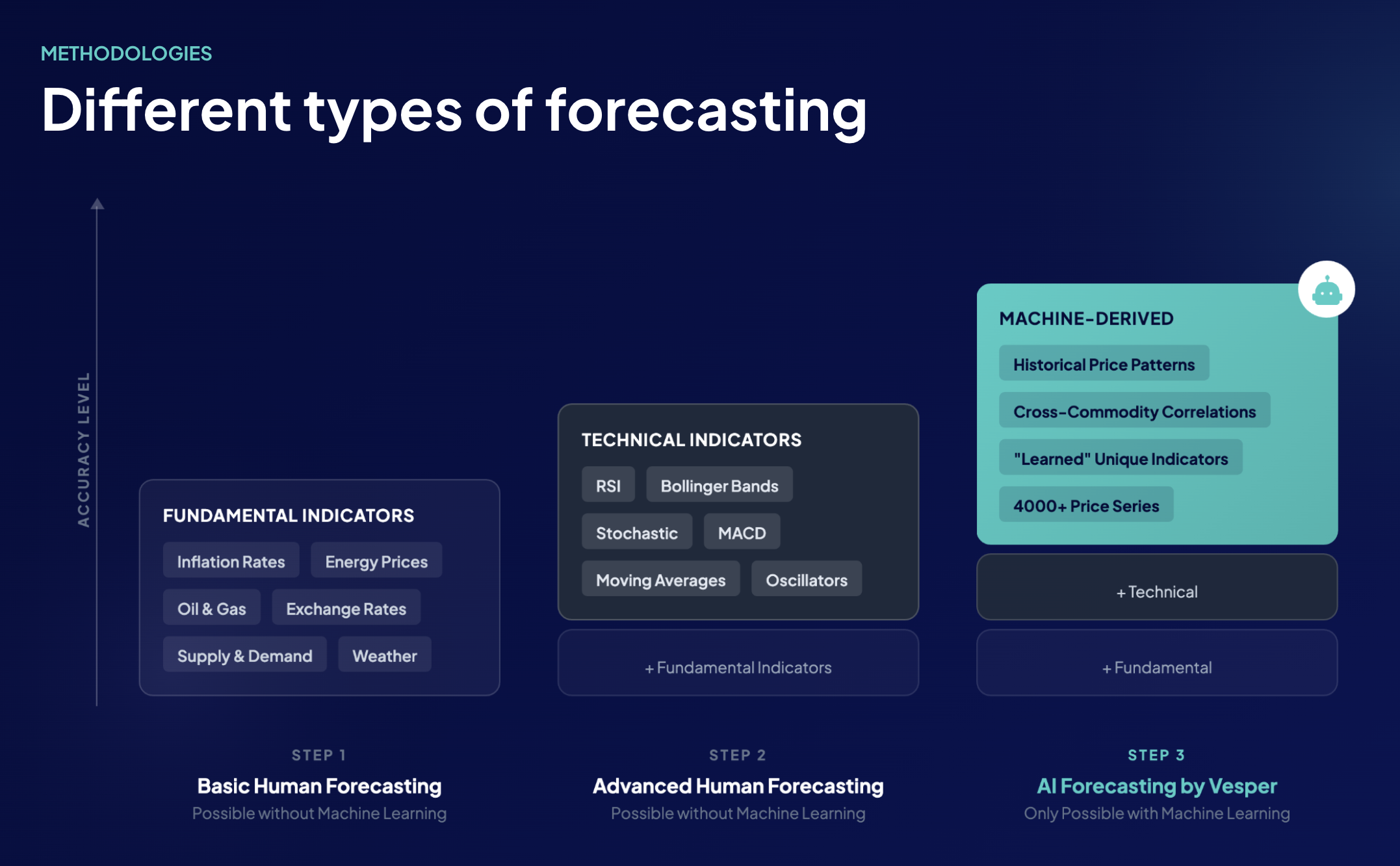
The three levels of commodity forecasting, Vesper’s AI layer compounds the methods below it.
The most basic level is fundamentals-only: supply and demand balances, inflation rates, energy and oil prices, exchange rates, weather. This is the analyst-desk standard, and a disciplined human can get a lot right with it.
A more advanced level layers technical indicators on top, RSI, Bollinger Bands, MACD, moving averages, stochastic oscillators, borrowed from financial markets and applied to commodity series. Both of these levels can be done by humans with spreadsheets and care.
AI forecasting starts where the human-led approach leaves off. It includes everything fundamentals and technical indicators provide, then adds three things a manual process can’t reach: cross-commodity correlations across thousands of related and unrelated series, machine-derived patterns inside those correlations, and “learned” indicators the model identifies on its own, relationships between variables no rulebook would have flagged. That’s the level Vesper’s forecasts operate at.
Older methods aren’t wrong; they’re foundational. AI compounds them, and the accuracy gain is what you’d expect when each layer adds new information.
What sets Vesper’s forecasts apart
Operating at the AI layer is one part of the story. The choices that turn that capability into accuracy procurement teams can defend are the rest of it. The points below are the things to ask any forecasting vendor about, and the answers Vesper puts on the page:
• Multi-horizon accuracy is published, not blended. One-, three-, six-, nine-, and twelve-month MAPE are shown separately for every series, with the drop-off across horizons visible. A flat or dynamically-quoted accuracy figure hides the horizon the buyer cares about; per-horizon disclosure makes the question answerable.
• Forecasts update automatically, 24/7. The moment a new data point arrives, a USDA report, a fresh new Vesper price tick, an updated S&D balance, the curve recomputes. There’s no analyst intervention to wait for and no risk of the forecast lagging an important market event.
• Each forecast runs on its own fundamentals, plus related-product fundamentals. Some forecasting approaches anchor a derivative product to a “parent commodity”, pricing whey protein off cheese, for example. Vesper builds the protein curve from protein fundamentals and the cheese fundamentals that drive whey availability. Both layers are weighted; neither is a shortcut for the other.
• In-product spot-checks at the horizon you care about. Hover any historical point on the chart and read the predicted-versus-actual pair. The same accuracy panel toggles between 1-month, 3-month, 6-month, and 12-month historical accuracy for that specific commodity, so the buyer can see how the model holds up at the timeframe that matches the decision. This matters because most modern forecasts (Vesper’s included) are dynamic: they adjust daily as new data arrives, which is what keeps them sharp. A single headline accuracy figure with no horizon attached tells you nothing about how far in advance the forecast was made, a prediction issued a day ahead of the realized price will report high accuracy almost regardless of skill. The horizon toggle is what makes the number meaningful.
• AI and analyst views are deliberately separated. The forecast curve is built from data only. Vesper analysts publish written market reports alongside it, but their views never blend into the curve. Where AI and analyst agree, conviction is high; where they diverge, that’s a signal to dig in. And direction is usually what matters most: even when a forecast isn’t pinpoint on price, getting the direction right, up or down, is what tells a buyer whether to delay a purchase or move on it now. The AI and the analyst almost always agree on direction, which is where most procurement decisions actually live.
• In-house AI, built well before ChatGPT was a household name. Vesper’s forecasting models are developed in-house by a team based in Amsterdam, one of Europe’s AI hubs. The architecture has been iterated since well before the current AI boom, and the institutional knowledge shows up in how the models handle commodity-specific edge cases and how quickly new approaches can be tested in production.
How to read a Vesper forecast: US Butter as a worked example
The platform-wide numbers are the headline. To make them concrete, here’s how a single forecast looks on the screen, and how to read it in practice. The example below is US Butter, anchored on the Vesper Price Index (VPI) on an EXW basis, in USD per pound.
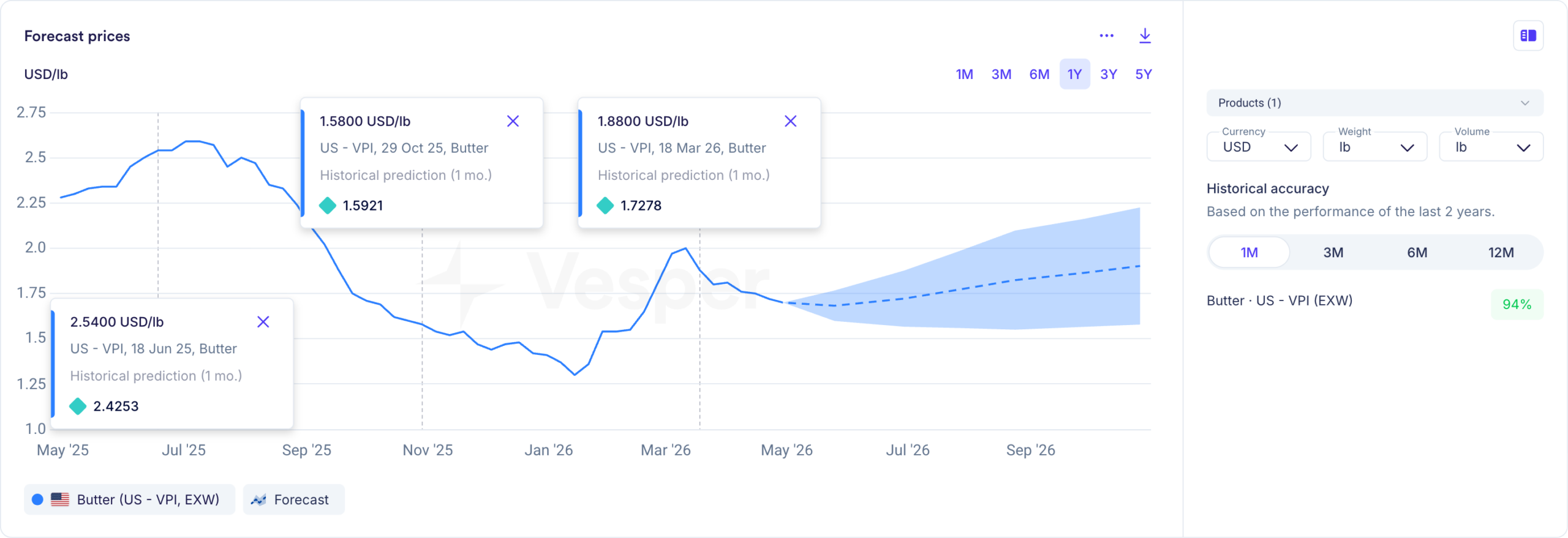
US Butter forecast widget, historical predictions, six-month forward curve, and 94% one-month historical accuracy on this specific series.
There are four things to read on the chart.
The solid line is the historical price, twelve months back. The dashed line picks up where the historical series ends and projects the price six months forward. The shaded band around the dashed line is the confidence interval, the range the model considers plausible at each point along the forecast. The narrower the band, the more confident the model. To the right of the chart sits the per-series accuracy panel: 94% at one month, 83% at three months, 77% at six months for this specific commodity, with a horizon toggle so the buyer can pick the timeframe that matches the decision in front of them.
The first thing to do with any new forecast is sanity-check it. Hover any point on the historical line and a tooltip surfaces two numbers side by side: the actual price on that date, and what the model had forecasted for it one month earlier. Three examples on US Butter:
• 18 June 2025 – actual: $2.54/lb. One-month-ahead forecast: $2.43/lb. Deviation: 4.5%.
• 29 October 2025 – actual: $1.58/lb. One-month-ahead forecast: $1.59/lb. Deviation: 0.8%.
• 18 March 2026 – actual: $1.88/lb. One-month-ahead forecast: $1.73/lb. Deviation: 8.1%.
All three got the direction right. Two landed inside the model’s average one-month error band; the third was further off, during a sharper move in the series. That mix is what real-world accuracy looks like, and the tooltips make every past prediction in the series checkable the same way. The point of this exercise isn’t to confirm a single number; it’s to develop a feel for how the model has handled the commodity in front of you before any budget gets committed to its forward curve.
Notice also that the per-series figures (94/83/77 for Butter) sit below the platform-wide averages (97/94/91/88/85). Butter is more volatile than the average commodity in Vesper’s coverage, and the model gets tested harder here than on a more stable series. The gap is informative, not something to hide.
Behind the curve: the four input layers
Once trained, Vesper’s model uses four categories of input. For US Butter, those layers look like this.
Price patterns. The starting point is the series itself plus adjacent products that move with it. For US Butter, that means CME Class III milk, US cream prices, EU butter (EEX), and AMF flowing into the same curve. Butter doesn’t trade in isolation, and the model picks up the cross-relationships.
Market fundamentals. USDA Dairy Products and Cold Storage reports, USDA NASS Milk Production, USDA FAS export data, EU Milk Market Observatory figures, and DCANZ data from New Zealand, since global supply affects US export pricing. Feed costs from CBOT corn, soybean meal, and DDGS feed in too, because they shape the milk-production margin, which shapes milk supply, which shapes butter availability downstream.
Technical indicators. Classic signals applied to the Butter series, MACD, moving averages, RSI, Bollinger Bands, stochastic oscillators, read directly inside the platform and also fed into the forecast model.
Macro and economic indicators. The US dollar index (export competitiveness for US dairy), energy and freight costs (manufacturing and logistics inputs), and macro demand signals tied to retail and foodservice categories. Where Vesper has partner data, Upply for freight, IBISWorld for industry costs, that flows in here.
The model weighs all four layers together. No single input dictates the curve.
Reading the technical layer alongside the AI curve
Because Vesper exposes the technical layer directly in the platform, a buyer can read the same signals the model reads.
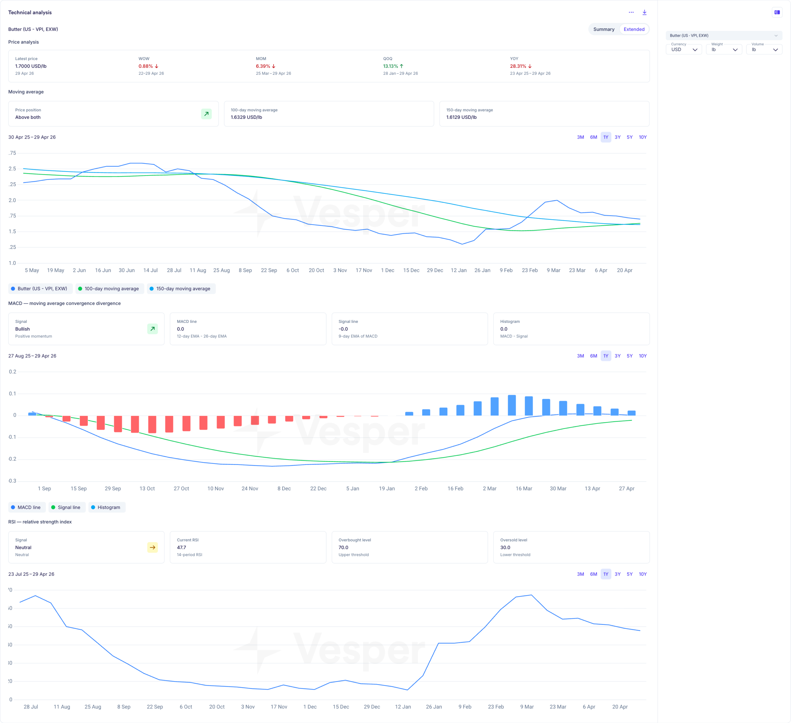
US Butter technical analysis, price action vs. moving averages, MACD momentum, and RSI.
As of 29 April 2026, the US Butter technical layer reads as follows. Price is $1.70/lb, sitting above both the 100-day moving average ($1.63) and the 150-day ($1.61), a bullish structural setup. MACD is bullish with positive momentum: the histogram has flipped from red bars (Sep ’25–Jan ’26) to blue bars building since February, even though the line, signal, and histogram all read close to zero. RSI is 47.7, neutral, with plenty of room before the 70 overbought threshold. The percentage moves tell the same story from a different angle: YoY ‒28.31% (the long downtrend), QoQ +13.13% (the recovery from Q1 lows), MoM ‒6.39% and WoW ‒0.88% (a small cooling-off this month).
Read together, those signals describe a market that found its floor in Q1, rallied hard into March, and is now consolidating above its medium-term trend, neither in trouble nor stretched. That’s the same picture the AI forecast curve draws: a gentle drift higher across the next six months.
Reading the curve for a buying decision
Two parts of the chart matter most when a buyer is sizing a forward commitment: the confidence band on the dashed forecast line, and the historical prediction tooltips on the past line.
The confidence band is where the buying decision actually lives. A narrow band early in the forecast horizon that widens further out is the normal shape, the model is more certain about next month than about Q3 next year, and it should be. When the band widens unusually fast, that’s the model signaling that the inputs are sending mixed messages, and the buyer should expect more revision in upcoming forecasts. When the band stays unusually narrow, the inputs are aligned, and conviction is high. A buyer making a forward commitment for Q3 isn’t betting that the price will land exactly on the dashed centerline; they’re sizing coverage against the range the band describes.
The historical prediction tooltips are how the band’s credibility gets earned in the first place. Pick a few months across the last two years on the commodity you actually buy. Hover the line. Read the predicted-versus-actual pair. If the model has tracked the series well, the conviction to act on the forward curve follows naturally. If it hasn’t, the tooltip will tell you that too, before any budget gets committed.
What this adds up to
A trustworthy commodity forecast has a few things working together: a model architecture that can generalize across thousands of series, a transparent input stack that traces back to known data sources, per-horizon accuracy figures verifiable against the specific commodity in front of you, and the discipline to keep AI and analyst views separate so each can be evaluated on its own merits.
That’s how Vesper’s forecasts are built. The methodology is on the screen, the accuracy is on the screen, and the data behind it traces back to the same primary sources procurement teams already trust. Pick a commodity, hover the line, and judge for yourself.
FAQ: Commodity price forecasting with Vesper
How accurate are Vesper’s forecasts on the specific commodity I buy?
Accuracy is published per commodity and per forecast horizon inside the platform. You can view one-, three-, six-, and twelve-month historical accuracy for the exact series you’re buying, rather than relying on a blended average.
How far ahead should I rely on a forecast when making buying decisions?
Shorter horizons are generally more accurate, which is reflected in the data. Most procurement decisions sit in the one- to six-month window, where accuracy remains highest and the confidence band is tighter.
Does the model rely more on fundamentals or technicals?
Both are included, alongside macro data and cross-commodity relationships. The model weighs all inputs dynamically, rather than prioritising one category over another.
How often are forecasts updated?
Forecasts update automatically as new data becomes available. There is no fixed schedule, the model recalculates continuously as inputs change.
Can I verify past forecast performance myself?
Yes. Historical predictions are visible directly on the chart. You can compare predicted versus actual prices at any point to understand how the model performed before relying on future projections.
What happens in highly volatile markets?
Accuracy typically decreases as volatility increases, which is reflected in both the historical accuracy figures and the widening of the confidence band. This is expected and visible to the user.
Are analyst views included in the forecast?
No. The forecast is fully data-driven. Analyst reports are published alongside the model output but remain separate, allowing you to compare both perspectives.
Is direction more important than exact price?
In most procurement decisions, yes. Even when the exact price level is not perfectly predicted, getting the direction right is often what determines whether to buy now or delay.