Dairy meets machine learning: a gentle overview of trade volume prediction using graph neural networks and transformers
Delayed Taste
Every minute, approximately 22 metric tons of butter are produced globally. This results in a complex trade landscape, with over 2,300 recorded transactions monthly. Given the vast uses of butter and its many derivative products, it is essential for buyers, sellers, and traders to monitor trade, ensuring they’re informed when making business decisions.
Yet, there is a challenge in accessing real-time insights. Due to the full reliance on governmental bodies for data collection, a notable delay exists. On average, it takes three months for all countries to report their trade volumes.
Our goal? Eliminate the reporting lag entirely. We aim to implement state-of-the-art technologies to forecast the last three months of international trade volumes, effectively bridging the gap.
Solving problems like this is at the core of Vesper. We strive to build the most comprehensive commodity intelligence platform, and we combine quality data and professional expertise with Data Science to produce unique tools for our users.
In this article, we provide an overview of our implementation. We will begin by walking you through the dynamics of the butter market, followed by an introduction to our novel problem representation using temporal graphs. Then, you will learn the basics of our machine learning model, with a brief summary of each of its three crucial components. And last, we will give insight into the results.
Butter Spreading All Over The World
Butter is one of the most actively traded commodities in the dairy industry. Each month, an impressive 200,000 metric tons of butter cross international boundaries. These imports and exports can range from mere fractions to tens of thousands of metric tons.
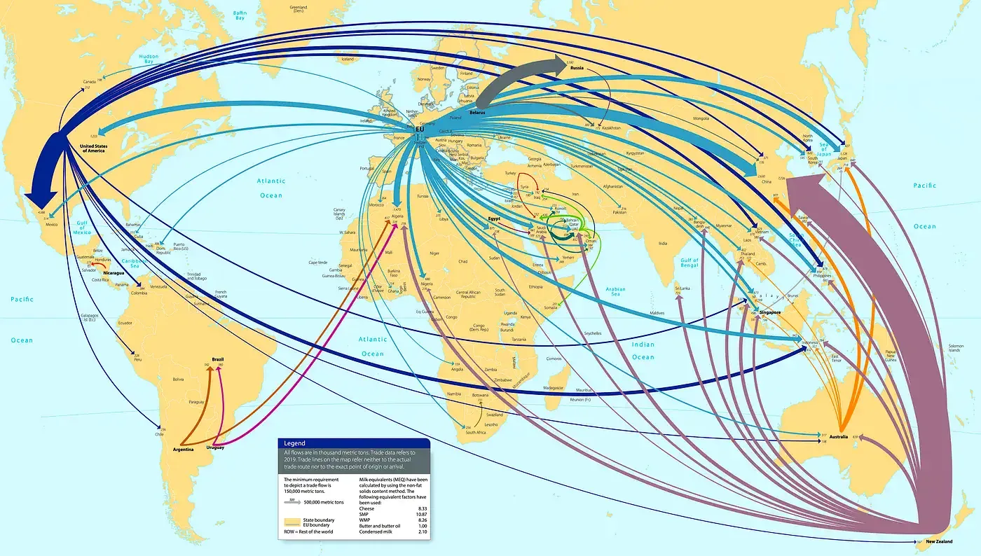
The international butter market operates largely as an oligopoly. The three dominant surplus producers are the US, New Zealand, and the countries in the EU, all competing for the demand of the other countries. In 2022, the US exported over 80,000 metric tons, New Zealand almost 480,000 mt, and the EU 188,000 mt. That same year, the average butter exports per country were approximately 53 mt. While other countries produce butter domestically, they often turn to one of the three major players for additional supply.
Over the years, many countries have established strong trade routes with these major producers, thanks to trade agreements and favourable geopolitical conditions. Consequently, trade interactions with these big players are generally consistent in volume and timing. This is relative to butter trades between other country pairs, which tend to be more sporadic. Often influenced by short-term events, their nature is considerably more ‘random’ and therefore harder to predict.
From a buyer’s standpoint, the choice of which major producer to source butter from depends on many factors. Since butter is a commodity, the differences are small, if not negligible. Therefore, the primary decision driver is the discrepancy in the offering prices of the big players, followed by tariffs and transportation costs.
Problem Representation: A Vast Social Network.
We use graphs to represent the dynamics of the butter trade market effectively. Unlike standard tables that list data points separately, graphs emphasise the links between them, preserving the valuable nuances of an interconnected network. This includes the types and strengths of relationships between data points.
To better visualise graphs, think of your social network of friends and colleagues. Each node is a person, and each edge represents your relationship with that person. Using graphs, we can represent your entire social network, preserving the unique qualities of the people as node features and the characteristics of the relationships saved as edge attributes.
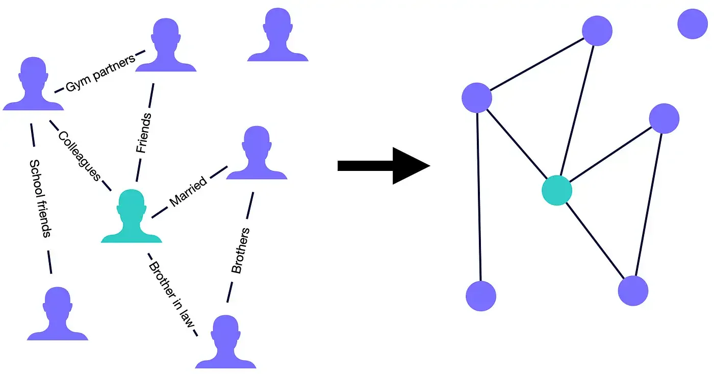
Similarly, in our scenario, we use nodes to symbolise individual countries and edges to denote trade events between them. Each country possesses a set of distinct qualities called country-specific features (stored in the nodes), such as domestic butter production or GDP. Then, there are characteristics exclusive to the country pair, called pair-specific attributes (saved in the edges), such as the trade volume or the prevailing exchange rate between the respective currencies.
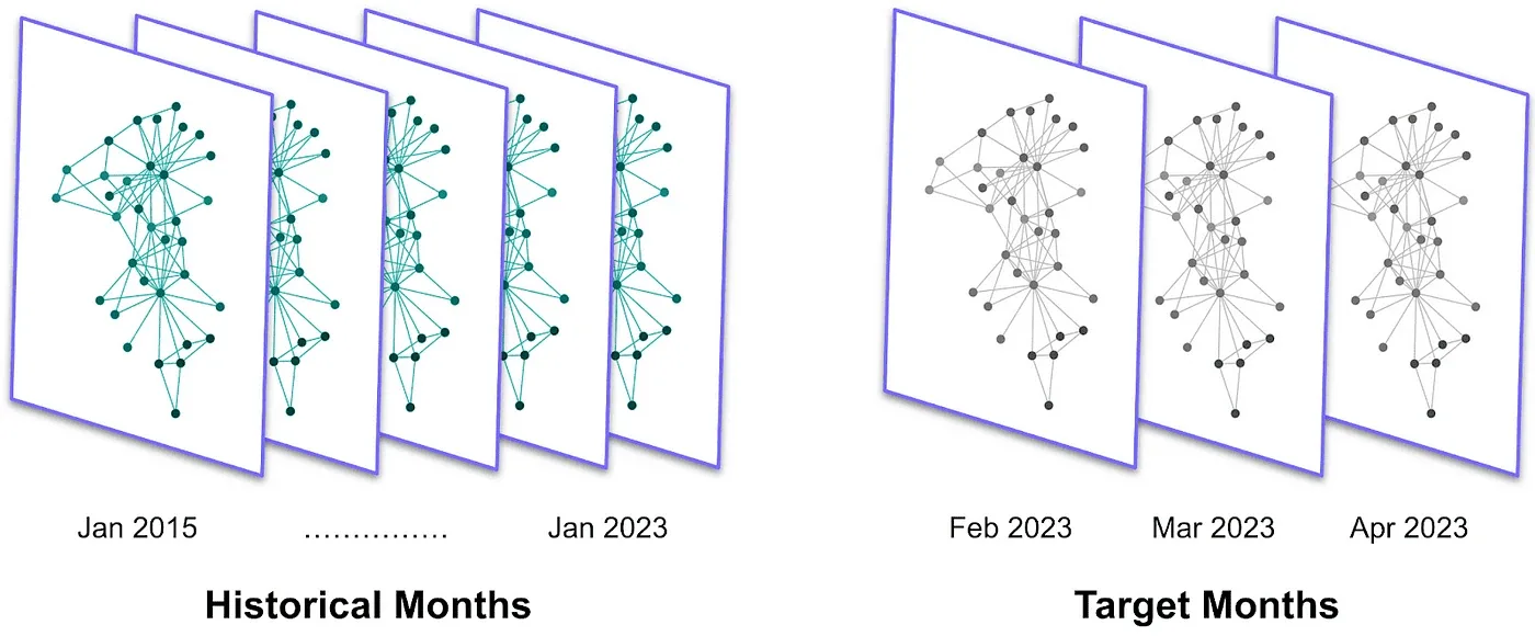
To create the graph, we use all our available import-export data from January 2015 onward. Firstly, we insert the available 242 nodes, one for each “country”. Then, we select all the recorded trades during that time window. The result is an impressive 267,376 edges.
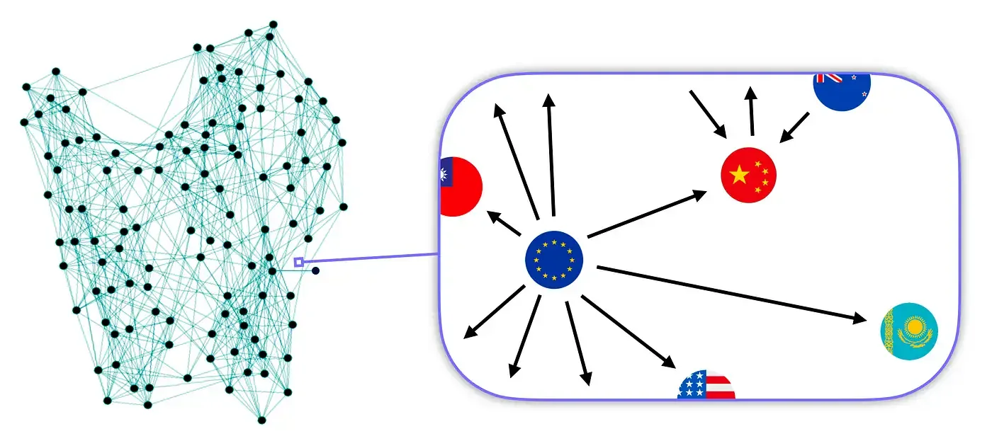
To better study the problem, we segment the data monthly. This yields a sequence of lighter graphs with approximately 2,000 edges, serving as a snapshot of the market’s monthly status. We can interpret this historical sequence of graphs as a general data series that groups the time series of many individual points. A time series is a set of measurements of a single variable over time, for instance, the trade volume between just one pair of countries.
The key benefit of our graph-based representation is its ability to capture world-wide trends. By grouping all the country pairs in a single structure, we can study multiple routes simultaneously. In contrast, standard forecasting techniques can handle only a single data series at a time.
Moreover, because all the other variables we are interested in (country-specific features and pair-specific attributes) don’t suffer from such a long delay, we can already create the graphs for the three most recent months we aim at predicting, called the target months. With this historical sequence of graphs, we are ready to develop our machine learning model.
Predicting Trade Volumes with Machine Learning
For our problem, we will implement an approach that falls under supervised learning. First, we train the model by giving it both the feature data and the target variable.
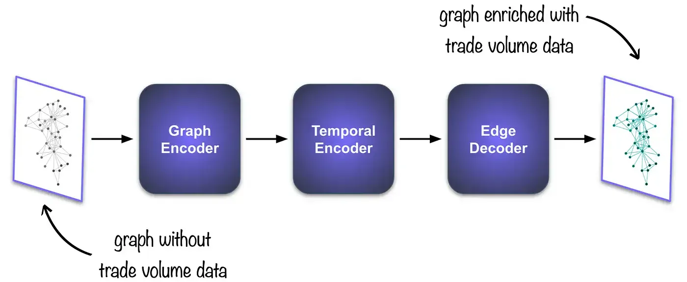
After training our model on historical months, we will input a monthly snapshot from the target months, holding all country-specific features and pair-specific attributes but lacking trade volume data. It will process it, and then, based on the patterns it has learned during training, it will output the predicted trade volumes for each country pair.
Knowing the overarching approach, let’s dissect our model into its components. Afterwards, we will discuss the results. Our model’s key parts are:
- Graph Encoder: to condense the individual graph into a machine-readable format called embeddings.
- Temporal Encoder: to extract the temporal relationships from previous monthly embeddings.
- Edge Decoder: to translate the embeddings into predictions for trade volumes.
Graph Encoder: Back to Social Networks.
For this component, we are interested in efficiently transforming all the data stored in the graph into a list of numbers. Due to the differences in form, some information loss is unavoidable. Our goal is to minimise this loss.
We deploy a Graph Neural Network (GNN). GNNs are capable of combining information from the individual node, its neighbourhood, and edge attributes. It’s like the saying that suggests a person is best defined by their closest friends. The GNN’s output is called node embeddings.
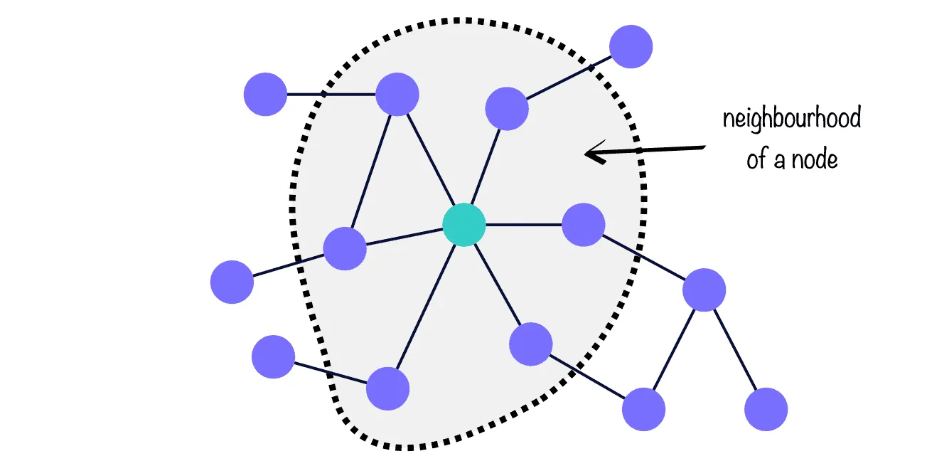
And much like in our social networks, where some friends are more influential to us than others, the same holds for nodes in a graph. In GNN jargon, this is called attention, and we use it in our model to rank which trade routes are most informative to predict other trade routes.
Temporal Encoder: Inspired by ChatGPT
This unit learns how a specific month is related to its predecessors. The idea is that a month’s market conditions are influenced by the market status of the preceding months. We deploy the Transformer, a cutting-edge architecture that lies at the foundation of language models like ChatGPT because of its power to make ‘sequence-to-sequence’ predictions.
Imagine a typing prediction scenario. Given a sentence (a sequence of words), the Transformer understands the order of the words and their significance in conveying the message, all relative to the general context of the phrase. It then outputs the word with the highest probability of being next in the sequence.
We cleverly apply this structure to our problem: each monthly snapshot is treated as a word, and the Transformer outputs the most probable node embeddings for the next month in the sequence.

Edge Decoder: Making Sense of Node Embeddings.
The purpose of this component can be seen as the inverse of the Graph Encoder. Instead of creating embeddings, it deciphers the embeddings it receives from the Temporal Encoder into predictions for the target variable. We implement two neural networks and set the goal of taking pairs of embeddings and extracting a single number: the forecast for the trade volume between two countries.
The result is a unit that can reconstruct the trade volume for each country pair within the graph for the month of interest. As such, the better the Edge Decoder, the closer the predictions will be to the actual values.
The Results
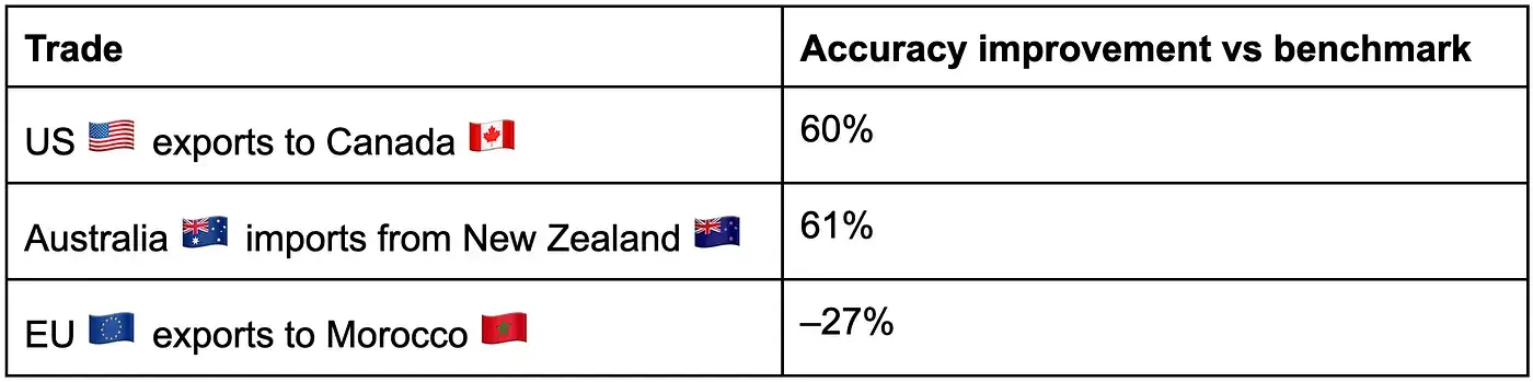
To evaluate the performance of our model, we take the three most recent months (with trade volume data available) and input them to the model. Then, we compare the predictions with the true values. To make the test valid, we never showed these three months to the model.
The model excels at predicting when no trade occurs between two countries. It also performs well with predicting when trade volumes are exceptionally high. This might be caused by the sheer size of the trade volumes, which significantly deviate from the mean value in the data and thus are easily recognisable by the model.
Interestingly, it struggles with average trade volumes. When we benchmark our predictions to traditional time-series forecasting methods, it becomes clear that, to enhance the accuracy of our model, we need to facilitate the distinction between average trade routes that are more similar to one another. This can be achieved by incorporating more data features, that help create a richer market representation, and by including trade information from other commodities.
Given these considerations, the average improvement of our model across all trade routes is negligible, and it is more informative to study individual pairs. Below, you can find performance of our model on two routes with very high volumes traded and one average. As you can see, the results differ a lot.